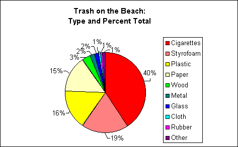
A pie graph is the best way to show portions, or parts of a whole. You're starting to pick up some real science smarts!
Pie graphs represent data in a visual, easy to read manner, which helps us to understand data more clearly.
Using this pie graph, we can see just what portion of all the trash each particular type of trash represents
(how big of a piece of cake each type of trash "eats"). It's as simple as that!
Even though graphs can look simple, there's a lot of information in a graph.

 Let's test your ability to read
a graph. Let's test your ability to read
a graph.
Q1: What type
of trash makes up the biggest portion of trash? (Hint: look
at the biggest piece of pie and then match its color with the type of trash
found in the legend on the right.)
- cigarettes
- styrofoam
- plastic
- paper
- wood
- metal
- glass
- cloth
- rubber
Q2: Can we say
what makes up the heaviest piece of trash from the graph?
Yes: - cigarettes
- styrofoam
- plastic
- paper
- wood
- metal
- glass
- cloth
- rubber
No: - not enough information provided
Back to Graph Types Overview
|

