Line Graphs: "like turns in a road"
A line graph is a good way to look at how something changes, usually over time or sometimes across space. Making a line graph is really just a matter of connecting the dots.
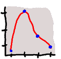
Our student scientists collected data on marine mammal sightings in the Santa Barbara Channel. The data tells us the year and the number of marine mammals seen. They displayed the data on several line graphs.
Take a look at the line graphs. As we move horizontally along the bottom of the graphs we see the dates in order. As we look at the vertical axis we see the number of dolphins sighted for each date.
By connecting the dots the students have shown that the data points are related. In this case they are related through time. The number for each species sighted changes through time. Maybe time has an effect on the number seen. For example, they could be seasonal, showing up in the winter and not the summer.